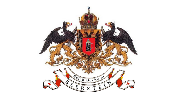


 The regimental inhibitors are in a quandary, which nation flag will accompany our army on the field of glory? Will it take a national referendum, or will our allies help by showing their preference?
Wednesday, December 10, 2008
Subscribe to:
Post Comments (Atom)
13 comments:
Since it appears to my eye that the only real difference is in the scrollwork, I'd ask if there were two classes of infantry units.
I know that Sweeden had "national" and "regional" troops . . . if Beerstein is similar, I'd use the "Reich Duchy" flag for the former and the "Beerstein" flag for the latter.
-- Jeff of Saxe-Bearstein
I would argue that most Grand Dukes of the Reich would prefer to keep the possibility of upward mobility to electoral or even royal status open, and therefore would not blazon their current title into their standard.
We believe our esteemed cousin is destined for greatness, we prefer the Beerstein only standard
I agree with Herzog Ignaz. You never can tell when the "Marrying Habsburgs" might decide to take a dip into the local waters for spousal material!
A Fair Point made above - I'll back the straight 'Beerstein' Flag.
Nice artwork, by the way.
I like the '2 scrolls' new version - the 2nd scroll fills an aesthetically unsatisfaying 'void' in the 1st pattern. (And the flag looks less like a beer bottle label, but perhaps this was precisely the intention?)
This smaller scroll may bear the regimental name?
Jean-Louis
Or the small scroll may display a motto.
With reference to the 'Dieu et mon Droit' of the English monarchy a Monte-Cristan scholar would suggest 'Dieu et mon Doigt' ("God and my Finger"), inherited from a 'Virgin Duchess' of old - obviously more successful as a virgin than as a duchess?
Maybe too 'Daisyesque'...
Please feel free to delete this comment!
Cheers,
Jean-Louis
Good points all around, but from a purely artistic/design point of view I agree with Jean-Louis about the 2nd scroll helping the design.
I hesitate to be critical, but to me the font seems a bit too "modern". German texts from this era usually had a more gothic/old English sort of font.
As a designer working "under client's instructions" ;-) I'm not really entirely free to wade in and comment here but I would like to say that flags of our period tended not to use heavy black letter fonts but rather used clearer (and rather modern looking) serifed and sans serifed ones. The font I'm using here is a version of Palatino, which, although modern, is based closely on 16th century typefaces, so undoubtedly has a period feel to it, especially as many 18th century typefaces were also inspired by their Renaissance forebears.
Regards,
David
http://nba-sywtemplates.blogspot.com/
Fair enough, David. I stand corrected and bow to your knowledge on the subject. I admit I'm not very well-versed in this era.
Thanks!
Thanks, FB. Hope my comment in response to yours didn't seem too "heavy handed"! I think the point that the version with 2 scrolls is better balanced by you and Jean-Louis is absolutely right. :-)
Regards,
David
http://nba-sywtemplates.blogspot.com/
David, no worries. I just hoped I hadn't given offense. Certainly none was meant. And we all appreciate the meticulous work you do on your templates and other works.
Cheers!
(the word verification word this time is "fuchip" - I think that's what caused my computer to die - a fuchip! lol)
Post a Comment